Button
Primary affordance. Merge-green for confirmation, default gray for secondary, blue outline for link-style, red for destructive.
html
Hand-tuned CSS, Primer-derived
1 props · 6 states · 9 tags · 2 소스
@dante · Developer Tools
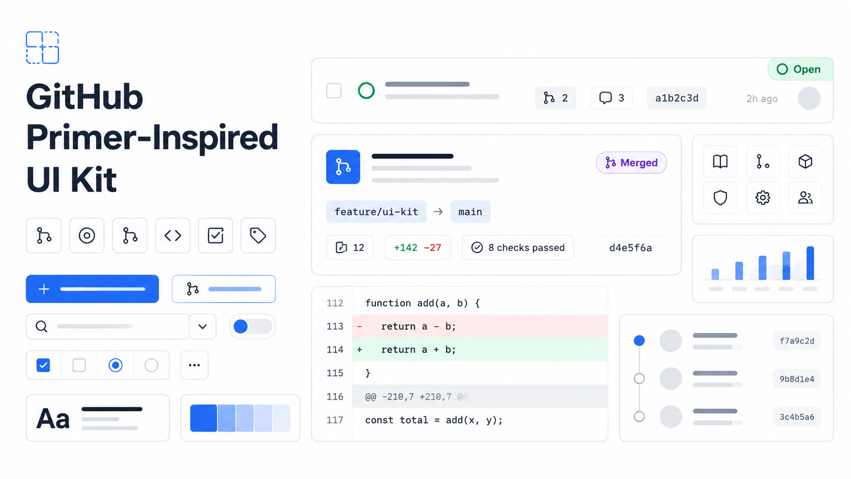
Code-forward, Primer-derived design system for developer tools — dense list rows, hairline borders, blue links, and merge-green CTAs on a true white canvas.
#ffffff (or #0d1117 for dark mode) — no warmth, no tint. Surfaces stack with hairline #d0d7de borders rather than negative space.#0969da for links and primary navigation. Merge green #1f883d (#1a7f37 hover) for confirmation, success, and the merge button. Red, purple, yellow, and pink are reserved for state semantics — never decoration.-apple-system, BlinkMacSystemFont, "Segoe UI" so text renders instantly on slow connections. Code uses ui-monospace, SFMono-Regular. Never load a webfont for chrome.Surfaces step from #ffffff (canvasDefault) → #f6f8fa (canvasSubtle, header strips, sidebars) → #eaeef2 (canvasInset, code blocks). Foreground steps from #1f2328 (default) to #656d76 (muted captions and file paths).
State pills use exact semantic hex: open #1a7f37, closed #cf222e, merged #8250df, draft #6e7781. Diffs add #dafbe1/#1a7f37 and delete #ffebe9/#cf222e. Hunk headers sit on #ddf4ff with #0969da foreground.
Buttons are 32px tall, 6px radius, 16px horizontal padding, with a 1px subtle shadow 0 1px 0 rgba(31,35,40,0.1). Inputs share the same height and radius; focus adds a 3px rgba(9,105,218,0.3) ring on a #0969da border. Cards have a #f6f8fa header strip with a hairline bottom divider and a #ffffff body. Status badges are pill-shaped (radius 9999px) with white text on the semantic background.
Lists are dense by design: 16px horizontal × 12px vertical row padding. Hover states swap the row background to canvasSubtle. Branch refs and SHAs are mono-font chips on #ddf4ff (or #dafbe1 for the default branch).
Base unit 4px; scale 4/8/12/16/24/32/40/48. Page max-width 1280px, sidebar 296px, collapses below 1012px. Motion is restrained: 80ms hover, 200ms popover, ease-out for opens and ease-in for closes. No parallax, no page-load animations, no persistent micro-interactions. Things appear; they do not perform.
패키지 안의 토큰·컴포넌트 정의로부터 순수하게 합성된 파생 뷰입니다 (편집 콘텐츠 없음).
#ffffff#f6f8fa#eaeef2#1f2328#656d76#0969da#0550ae#ddf4ff#1a7f37#1f883d#dafbe1#cf222e#a40e26#ffebe9#9a6700#fff8c5#8250df#bf3989#6e7781#d0d7de#d8dee4#eaeef2#0d1117#161b22#30363d#e6edf3#dafbe1#1a7f37#ffebe9#cf222e-apple-system, BlinkMacSystemFont, "Segoe UI", "Noto Sans", Helvetica, Arial, sans-serif-apple-system, BlinkMacSystemFont, "Segoe UI", "Noto Sans", Helvetica, Arial, sans-serifui-monospace, SFMono-Regular, "SF Mono", Menlo, Consolas, "Liberation Mono", monospace"Apple Color Emoji", "Segoe UI Emoji"{
"display": "32px/1.25",
"h1": "24px/1.25",
"h2": "20px/1.25",
"h3": "16px/1.25",
"body": "14px/1.5",
"small": "12px/1.4",
"code": "12px/1.45"
}Primary affordance. Merge-green for confirmation, default gray for secondary, blue outline for link-style, red for destructive.
Single-line text field with Primer-blue focus ring.
Box with f6f8fa header strip and white body, separated by hairline border.
Pill-shaped status badge for issue/PR state.
system-ui headline scale at 32/24/20/16, weight 600 only.
Primer-blue link, underline on hover.
Repository header strip with title, description, and primary action.
Tab-style navigation with bottom border indicator.
Page footer with muted links and copyright.
Inline numeric metric (stars, forks, watchers).
Dense issue list row with state icon, title, labels, and metadata.
Pull request row with merge status icon and branch info.
Single commit row with SHA, message, and author timestamp.
Inline branch reference with mono font and subtle blue background.
Unified diff block with green additions and red deletions.
Sidebar block with repo About info — language dot, license, topics.
#ffffff (or #0d1117 for dark mode) — no warmth, no tint. Surfaces stack with hairline #d0d7de borders rather than negative space.#0969da for links and primary navigation. Merge green #1f883d (#1a7f37 hover) for confirmation, success, and the merge button. Red, purple, yellow, and pink are reserved for state semantics — never decoration.-apple-system, BlinkMacSystemFont, "Segoe UI" so text renders instantly on slow connections. Code uses ui-monospace, SFMono-Regular. Never load a webfont for chrome.Surfaces step from #ffffff (canvasDefault) → #f6f8fa (canvasSubtle, header strips, sidebars) → #eaeef2 (canvasInset, code blocks). Foreground steps from #1f2328 (default) to #656d76 (muted captions and file paths).
State pills use exact semantic hex: open #1a7f37, closed #cf222e, merged #8250df, draft #6e7781. Diffs add #dafbe1/#1a7f37 and delete #ffebe9/#cf222e. Hunk headers sit on #ddf4ff with #0969da foreground.
Buttons are 32px tall, 6px radius, 16px horizontal padding, with a 1px subtle shadow 0 1px 0 rgba(31,35,40,0.1). Inputs share the same height and radius; focus adds a 3px rgba(9,105,218,0.3) ring on a #0969da border. Cards have a #f6f8fa header strip with a hairline bottom divider and a #ffffff body. Status badges are pill-shaped (radius 9999px) with white text on the semantic background.
Lists are dense by design: 16px horizontal × 12px vertical row padding. Hover states swap the row background to canvasSubtle. Branch refs and SHAs are mono-font chips on #ddf4ff (or #dafbe1 for the default branch).
Base unit 4px; scale 4/8/12/16/24/32/40/48. Page max-width 1280px, sidebar 296px, collapses below 1012px. Motion is restrained: 80ms hover, 200ms popover, ease-out for opens and ease-in for closes. No parallax, no page-load animations, no persistent micro-interactions. Things appear; they do not perform.
DESIGN.mdtext/markdownSKILL.mdtext/markdowntokens/colors.jsonapplication/jsontokens/typography.jsonapplication/jsontokens/components.jsonapplication/jsonadapters/tokens.csstext/cssadapters/shadcn-registry.jsonapplication/jsonadapters/tailwind.config.jstext/javascriptadapters/react/index.tstext/typescriptadapters/html/index.htmltext/htmladapters/html/styles.csstext/css