Button
Two-color conversion hierarchy — near-black #080808 primary, white-on-hairline secondary, plus a text-arrow link and a circular icon control. All buttons take a tight 4px radius; the brand never uses pill CTAs.
@dante · Design & Creative
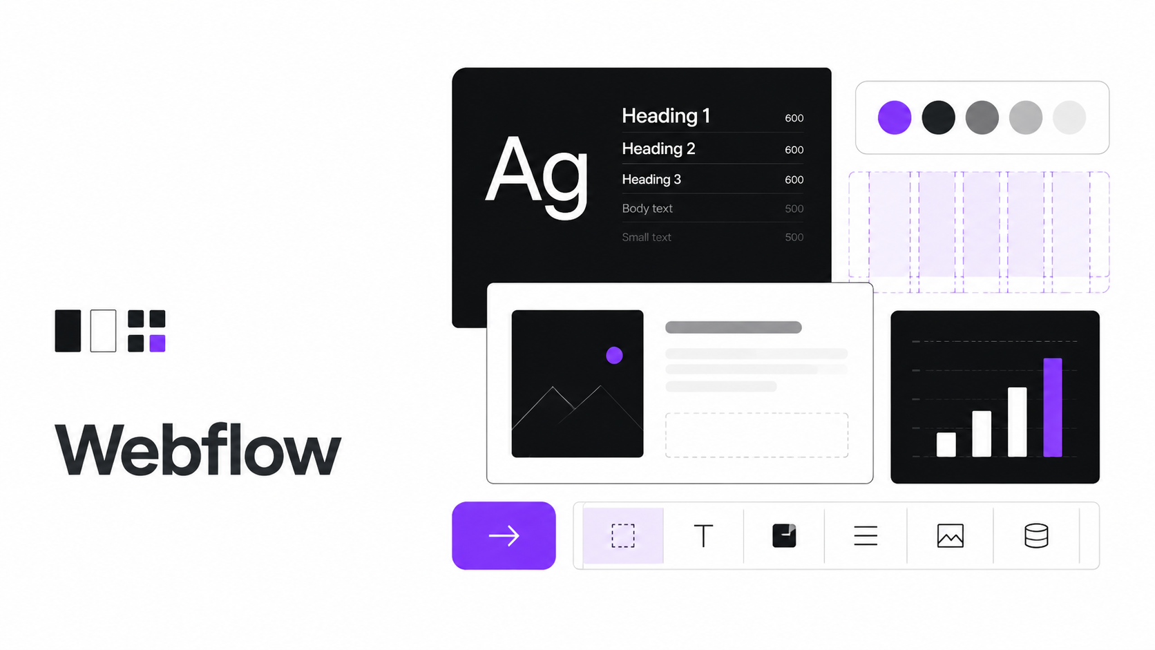
Visual-web-platform design system: deep near-black #080808 on a generous white canvas, a five-stop chromatic category palette, and single-family WF Visual Sans at restrained 500/600 weights.
A confident, professional visual-web-platform surface — generous white canvas anchored by a deep near-black #080808 used for every primary CTA, heading, and wordmark. The signature move is a five-stop chromatic category palette — purple, pink, blue, orange, green — deployed as full-saturation card fills that map to the platform's product surfaces, never as button colors. The result reads as engineered and editorial rather than as a playful tech startup: restrained shape, tight kerning, and a single typographic family doing all the work.
Two-color conversion hierarchy: near-black #080808 for every primary action and white-on-hairline #d8d8d8 for every secondary. Around this restrained primary sit the five chromatic accents — #7a3dff purple, #ed52cb pink, #3b89ff blue, #ff6b00 orange, #00d722 green — used as full-bleed category-card fills. Deep-blue #006acc and info-blue #146ef5 carry emphasis links and badges; #ffae13 warns and #ee1d36 signals errors. Text steps through warm-neutral grays from ink #080808 down to mute-soft #ababab.
A single proprietary family, WF Visual Sans Variable (Inter fallback), carries every role at weights 400/500/550/600 — the brand never goes heavier than semibold. Hero display sits at 80px/600 with -0.8px negative tracking; section headlines at 44.8px/600; card headings at 32px/500. Uppercase eyebrows at 15px/500 with +1.5px tracking mark every section. A mono variant (Inconsolata fallback) appears only for technical captions.
A 4px base spacing unit scales through 8/12/16/20/24/32px, with 32px section gutters and 32px card interiors. Radius is deliberately tight: 4px for buttons, badges, and inputs; 8px for cards and category tiles; pill 9999px reserved for circular icon buttons. Depth comes from 1px hairline borders and the brand's distinctive five-stop layered drop-shadow on featured cards — never from heavy material shadows or gradients.
Buttons take a tight 4px radius in a two-color hierarchy — never pills, never chromatic fills. Cards sit on canvas with a hairline border, stepping up to the layered drop-shadow when featured, with a polarity-flipped near-black variant. Category cards fill full-saturation purple/pink/blue/orange/green. Badges use the signature 550-weight caption. Inputs lift their border to info-blue on focus.
패키지 안의 토큰·컴포넌트 정의로부터 순수하게 합성된 파생 뷰입니다 (편집 콘텐츠 없음).
#080808#ffffff#222222#363636#5a5a5a#898989#ababab#d8d8d8#ffffff#7a3dff#ed52cb#3b89ff#006acc#146ef5#ff6b00#00d722#ffae13#ee1d36WF Visual Sans Variable, Inter, system-ui, -apple-system, sans-serifWF Visual Sans Variable, Inter, system-ui, sans-serifWF Visual Sans Variable, Inter, system-ui, sans-serifWF Visual Sans Variable, Inter, system-ui, sans-serifWFVisualSans-Mono, Inconsolata, ui-monospace, SFMono-Regular, Menlo, monospace{
"displayXxl": "80px/1.04",
"displayXl": "56px/1.04",
"displayLg": "44.8px/1.04",
"displayMd": "32px/1.30",
"displaySm": "24px/1.30",
"displayXs": "20px/1.40",
"eyebrow": "15px/1.30",
"bodyLg": "28.8px/1.60",
"body": "16px/1.60",
"bodySm": "14px/1.60",
"caption": "12.8px/1.20",
"captionMono": "12px/1.50",
"button": "16px/1.60"
}Two-color conversion hierarchy — near-black #080808 primary, white-on-hairline secondary, plus a text-arrow link and a circular icon control. All buttons take a tight 4px radius; the brand never uses pill CTAs.
Single-line field on canvas white with a 1px hairline #d8d8d8 border and a tight 4px radius. Focus lifts the border to info-blue #146ef5 with a soft ring.
Canvas feature card with a hairline border, 8px radius, and 32px padding — lifted with the brand's 5-stop layered drop-shadow only when featured. A polarity-flipped near-black variant reverses ink and canvas.
Info badge in solid info-blue or a soft outline, set in the brand's signature 550-weight caption at 12.8px with a tight 4px radius.
Single-family WF Visual Sans hierarchy — hero at 80px/600 with -0.8px tracking, sections at 44.8px/600, card headings at 32px/500. The weight ceiling is 600; uppercase eyebrows mark every section.
Quiet inline links in ink with an underline-on-hover; deep-blue #006acc for emphasis links, and info-blue on dark surfaces.
White hero band with an 80px/600 headline at -0.8px tracking, a body-mid subtitle, and a near-black primary CTA paired with a white-on-hairline secondary.
Sticky top nav on canvas white with an ink wordmark, body-sm-strong links, and a single near-black CTA.
Canvas footer band with body-mid utility links, a hairline top divider, and body-sm type — the quiet closing band of the marketing surface.
Large display-scale numeric figure with a body-sm label and a hairline top divider — the platform's confident proof-point row.
Pull-quote in body-lg 28.8px at weight 400 with a purple accent opening mark — a restrained editorial testimonial moment.
Category pill mapping the five-stop chromatic system — purple, pink, blue, orange, green — used as product-category markers at full saturation.
Round avatar with a white ring against canvas — chromatic-accent fills tie each avatar to a category; stacks overlap for team rosters.
Segmented tab list inside an 8px-rounded hairline container — the active pill flips to near-black; used to switch Designer / CMS / Hosting views.
A confident, professional visual-web-platform surface — generous white canvas anchored by a deep near-black #080808 used for every primary CTA, heading, and wordmark. The signature move is a five-stop chromatic category palette — purple, pink, blue, orange, green — deployed as full-saturation card fills that map to the platform's product surfaces, never as button colors. The result reads as engineered and editorial rather than as a playful tech startup: restrained shape, tight kerning, and a single typographic family doing all the work.
Two-color conversion hierarchy: near-black #080808 for every primary action and white-on-hairline #d8d8d8 for every secondary. Around this restrained primary sit the five chromatic accents — #7a3dff purple, #ed52cb pink, #3b89ff blue, #ff6b00 orange, #00d722 green — used as full-bleed category-card fills. Deep-blue #006acc and info-blue #146ef5 carry emphasis links and badges; #ffae13 warns and #ee1d36 signals errors. Text steps through warm-neutral grays from ink #080808 down to mute-soft #ababab.
A single proprietary family, WF Visual Sans Variable (Inter fallback), carries every role at weights 400/500/550/600 — the brand never goes heavier than semibold. Hero display sits at 80px/600 with -0.8px negative tracking; section headlines at 44.8px/600; card headings at 32px/500. Uppercase eyebrows at 15px/500 with +1.5px tracking mark every section. A mono variant (Inconsolata fallback) appears only for technical captions.
A 4px base spacing unit scales through 8/12/16/20/24/32px, with 32px section gutters and 32px card interiors. Radius is deliberately tight: 4px for buttons, badges, and inputs; 8px for cards and category tiles; pill 9999px reserved for circular icon buttons. Depth comes from 1px hairline borders and the brand's distinctive five-stop layered drop-shadow on featured cards — never from heavy material shadows or gradients.
Buttons take a tight 4px radius in a two-color hierarchy — never pills, never chromatic fills. Cards sit on canvas with a hairline border, stepping up to the layered drop-shadow when featured, with a polarity-flipped near-black variant. Category cards fill full-saturation purple/pink/blue/orange/green. Badges use the signature 550-weight caption. Inputs lift their border to info-blue on focus.
DESIGN.mdtext/markdownSKILL.mdtext/markdowntokens/colors.jsonapplication/jsontokens/typography.jsonapplication/jsontokens/components.jsonapplication/jsonadapters/tokens.csstext/cssadapters/shadcn-registry.jsonapplication/jsonadapters/tailwind.config.jstext/javascriptadapters/react/index.tstext/typescriptadapters/html/index.htmltext/htmladapters/html/styles.csstext/css