Design system
web
v1.0.0
90/100

Voltagent

@dante · AI & LLM

Developer-first AI agent platform kit: an unrelenting near-black canvas, a single electric-green accent, hairline-bordered feature cards, and Inter + SF Mono code mockups.

HTML/CSS
React
shadcn/ui
Tailwind
#ai
#llm
#voltagent
Voltagent
Downloads1
Download package
DESIGN.mdSKILL.md

Overview

Voltagent

Visual Theme

Voltagent is an AI agent engineering platform that wears its developer audience proudly. The entire page is a single near-black canvas (#101010) that runs edge-to-edge with no light-mode counterpart, broken only by hairline-bordered feature cards and code-editor mockups. A lone electric-green accent (#00d992) carries every CTA, status pill, and the brand's lightning glyph. The result reads like polished documentation that decided to also sell something — engineered, restrained, and unmistakably technical.

Color Principles

The brand is dark-canvas only. Near-black #101010 is the sole page surface, with a slightly lighter #1a1a1a fill inside code blocks and inputs. A single electric-green #00d992 is the center of gravity, reserved for CTAs, live indicators, and the logo; #2fd6a1 and #10b981 handle ghost buttons and inline links. Text steps from off-white ink (#f2f2f2) and pure white (#ffffff) down through body grey (#bdbdbd) to mute (#8b949e). Every edge is a 1px hairline in #3d3a39 — the brand's universal border colour. No shadows, no second accent.

Typography

Two faces carry the system. Inter handles every display, body, button, and link role at weights 400–700; SF Mono is reserved for code blocks, inline command snippets, and numeric counters. The hero display sits at 60px in a calm weight 400 with -0.65px tracking, reading like a documentation H1 rather than a billboard. Uppercase mono-cap eyebrows at 14px / weight 600 with 2.52px tracking are the signature label style. Body copy runs 16px at line-height 1.6 for long-form legibility.

Layout

A 4px base spacing scale climbs to 64px; hero and content bands pad 48px top/bottom, feature cards 24px inside. Containers centre around 1200–1400px with 32px gutters. Radii stay tight: 6px buttons and inputs, 8px cards and code chrome, 9999px only for inline status tags. Depth is a hairline system — 1px solid borders on the dark canvas, an occasional 2px green edge for featured cards, and a 1px dashed slate divider between bands. Never a drop shadow.

Components

Buttons are tight 6px rectangles: green primary, hairline-outline secondary, green ghost, hairline pill tags. Feature cards are near-black with 1px hairline borders. Code mockups carry copy-to-clipboard affordances and SF Mono bodies. Inputs sit on the canvas-soft fill with a green focus ring. The green glow band is the only chromatic divider.
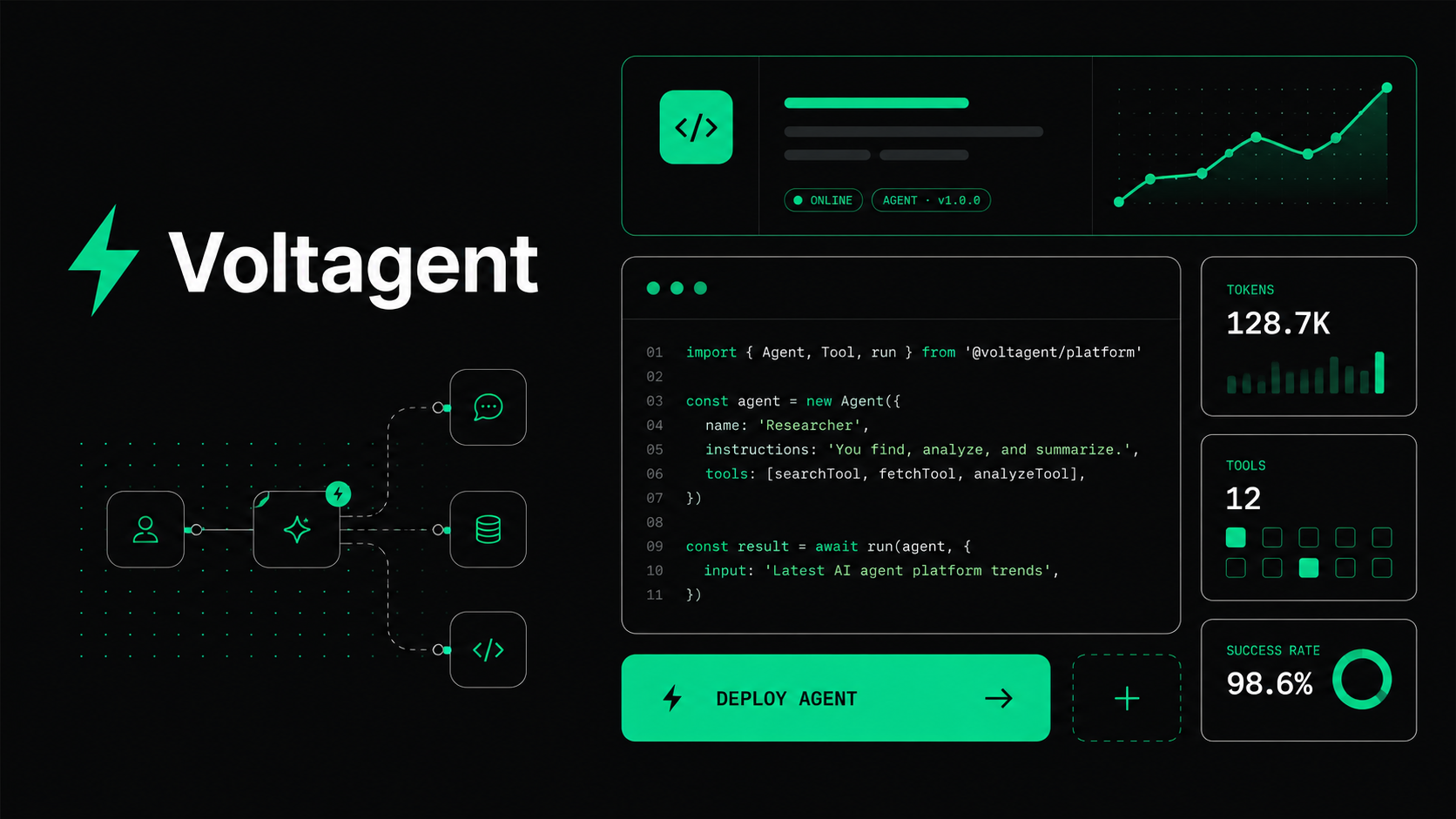
Derived view rendered server-side from package tokens and components — no authored copy.

Colors (13)

primary
#00d992
primarySoft
#2fd6a1
primaryDeep
#10b981
onPrimary
#101010
ink
#f2f2f2
inkStrong
#ffffff
body
#bdbdbd
mute
#8b949e
hairline
#3d3a39
hairlineSoft
#b8b3b0
canvas
#101010
canvasSoft
#1a1a1a
canvasTextSoft
#f5f6f7

Typography (6)

display
Inter, system-ui, -apple-system, 'Segoe UI', Roboto, sans-serif
  • 48pxThe quick brown fox jumps over the lazy dog 1234
  • 32pxThe quick brown fox jumps over the lazy dog 1234
  • 24pxThe quick brown fox jumps over the lazy dog 1234
  • 18pxThe quick brown fox jumps over the lazy dog 1234
  • 14pxThe quick brown fox jumps over the lazy dog 1234
  • 12pxThe quick brown fox jumps over the lazy dog 1234
heading
Inter, system-ui, -apple-system, 'Segoe UI', Roboto, sans-serif
  • 48pxThe quick brown fox jumps over the lazy dog 1234
  • 32pxThe quick brown fox jumps over the lazy dog 1234
  • 24pxThe quick brown fox jumps over the lazy dog 1234
  • 18pxThe quick brown fox jumps over the lazy dog 1234
  • 14pxThe quick brown fox jumps over the lazy dog 1234
  • 12pxThe quick brown fox jumps over the lazy dog 1234
body
Inter, system-ui, -apple-system, sans-serif
  • 48pxThe quick brown fox jumps over the lazy dog 1234
  • 32pxThe quick brown fox jumps over the lazy dog 1234
  • 24pxThe quick brown fox jumps over the lazy dog 1234
  • 18pxThe quick brown fox jumps over the lazy dog 1234
  • 14pxThe quick brown fox jumps over the lazy dog 1234
  • 12pxThe quick brown fox jumps over the lazy dog 1234
ui
Inter, system-ui, -apple-system, sans-serif
  • 48pxThe quick brown fox jumps over the lazy dog 1234
  • 32pxThe quick brown fox jumps over the lazy dog 1234
  • 24pxThe quick brown fox jumps over the lazy dog 1234
  • 18pxThe quick brown fox jumps over the lazy dog 1234
  • 14pxThe quick brown fox jumps over the lazy dog 1234
  • 12pxThe quick brown fox jumps over the lazy dog 1234
mono
SFMono-Regular, Menlo, Monaco, Consolas, 'Liberation Mono', monospace
  • 48pxThe quick brown fox jumps over the lazy dog 1234
  • 32pxThe quick brown fox jumps over the lazy dog 1234
  • 24pxThe quick brown fox jumps over the lazy dog 1234
  • 18pxThe quick brown fox jumps over the lazy dog 1234
  • 14pxThe quick brown fox jumps over the lazy dog 1234
  • 12pxThe quick brown fox jumps over the lazy dog 1234
scale
unparsed
{
  "displayXl": "60px/60px",
  "displayLg": "36px/40px",
  "displayMd": "24px/32px",
  "displaySm": "20px/28px",
  "eyebrowMono": "14px/20px",
  "eyebrowUppercase": "18px/28px",
  "bodyLg": "18px/28px",
  "body": "16px/26px",
  "bodySm": "14px/20px",
  "caption": "12px/16px",
  "code": "13px/18px",
  "button": "16px/24px"
}

Components (15)

Button

Tight 6px-rounded controls on dark. Electric-green primary with near-black label; hairline-outline secondary; green ghost; hairline pill for tags. No shadows, no pills except tags.

html
Hand-tuned CSS, no framework
2 props · 5 states · 10 tags · 2 sources
Missing states: loading

Input

Dark field on canvas-soft fill with a 1px hairline border and 6px radius. Focus lifts the border to primary-soft green with a matching glow ring.

html
Hand-tuned CSS, no framework
2 props · 5 states · 8 tags · 2 sources

Card

The brand's workhorse feature card — near-black fill, 1px hairline border, 8px radius, no shadow. The emphasized variant swaps to a 3px hairline or a 2px green edge.

html
Hand-tuned CSS, no framework
1 props · 3 states · 9 tags · 2 sources
Missing states: disabled

Badge

Compact status marker — hairline pill for neutral, tinted green for live/new, canvas-soft for muted metadata.

html
Hand-tuned CSS, no framework
1 props · 1 states · 7 tags · 2 sources
Missing states: hover, focus-visible, disabled

Heading

Calm Inter hierarchy — hero display at 60px weight 400 with -0.65px tracking reads like a documentation H1, stepping down to bold 24px card titles.

html
Hand-tuned CSS, no framework
1 props · 1 states · 9 tags · 2 sources
Missing states: hover, focus-visible, disabled

Link

Quiet inline links in primary-deep green on the dark canvas, brightening to electric green on hover. Underline-on-hover, never a body-text fill.

html
Hand-tuned CSS, no framework
1 props · 4 states · 4 tags · 2 sources
Missing states: disabled

Hero

Near-black hero band with a 60px Inter headline, tracked mono-cap eyebrow, and a green primary CTA beside a hairline-outline secondary.

html
Hand-tuned CSS, no framework
1 props · 1 states · 7 tags · 2 sources
Missing states: hover, focus-visible, disabled

Nav

Sticky top nav on near-black canvas — wordmark with a green lightning glyph, muted body-grey links, and a single green CTA.

html
Hand-tuned CSS, no framework
0 props · 3 states · 6 tags · 2 sources
Missing states: disabled

Footer

Near-black footer band with muted body-grey utility links and a hairline divider — the quiet close of the continuous dark surface.

html
Hand-tuned CSS, no framework
0 props · 2 states · 7 tags · 2 sources
Missing states: focus-visible, disabled

Stat

Monospace numeric counter with a muted sans label — benchmark figures rendered in SF Mono, the single most-important number tinted electric green.

html
Hand-tuned CSS, no framework
1 props · 1 states · 7 tags · 2 sources
Missing states: hover, focus-visible, disabled

CodeMockup

The dark code-editor card — near-black fill, hairline border, SF Mono 13px body, a green comment line and a copy-to-clipboard affordance.

html
Hand-tuned CSS, no framework
1 props · 2 states · 7 tags · 2 sources
Missing states: focus-visible, disabled

CodeChip

Inline command snippet pill on canvas-soft fill — cool-toned SF Mono text at 6px radius for npx / install commands within prose.

html
Hand-tuned CSS, no framework
0 props · 2 states · 2 tags · 2 sources
Missing states: focus-visible, disabled

Divider

Section rhythm cues — a 1px dashed slate divider between bands and the signature 2px electric-green glow band for major section breaks.

html
Hand-tuned CSS, no framework
1 props · 1 states · 5 tags · 2 sources
Missing states: hover, focus-visible, disabled

Tab

Segmented tab list inside a canvas-soft container — active pill lifts to near-black with a green underline for switching between docs surfaces.

html
Hand-tuned CSS, no framework
1 props · 4 states · 4 tags · 2 sources
Missing states: disabled

Table

Data table with a canvas-soft header in tracked mono-caps and hairline row borders — the documentation-grade comparison surface.

html
Hand-tuned CSS, no framework
0 props · 2 states · 4 tags · 2 sources
Missing states: focus-visible, disabled

DESIGN.md

Voltagent

Visual Theme

Voltagent is an AI agent engineering platform that wears its developer audience proudly. The entire page is a single near-black canvas (#101010) that runs edge-to-edge with no light-mode counterpart, broken only by hairline-bordered feature cards and code-editor mockups. A lone electric-green accent (#00d992) carries every CTA, status pill, and the brand's lightning glyph. The result reads like polished documentation that decided to also sell something — engineered, restrained, and unmistakably technical.

Color Principles

The brand is dark-canvas only. Near-black #101010 is the sole page surface, with a slightly lighter #1a1a1a fill inside code blocks and inputs. A single electric-green #00d992 is the center of gravity, reserved for CTAs, live indicators, and the logo; #2fd6a1 and #10b981 handle ghost buttons and inline links. Text steps from off-white ink (#f2f2f2) and pure white (#ffffff) down through body grey (#bdbdbd) to mute (#8b949e). Every edge is a 1px hairline in #3d3a39 — the brand's universal border colour. No shadows, no second accent.

Typography

Two faces carry the system. Inter handles every display, body, button, and link role at weights 400–700; SF Mono is reserved for code blocks, inline command snippets, and numeric counters. The hero display sits at 60px in a calm weight 400 with -0.65px tracking, reading like a documentation H1 rather than a billboard. Uppercase mono-cap eyebrows at 14px / weight 600 with 2.52px tracking are the signature label style. Body copy runs 16px at line-height 1.6 for long-form legibility.

Layout

A 4px base spacing scale climbs to 64px; hero and content bands pad 48px top/bottom, feature cards 24px inside. Containers centre around 1200–1400px with 32px gutters. Radii stay tight: 6px buttons and inputs, 8px cards and code chrome, 9999px only for inline status tags. Depth is a hairline system — 1px solid borders on the dark canvas, an occasional 2px green edge for featured cards, and a 1px dashed slate divider between bands. Never a drop shadow.

Components

Buttons are tight 6px rectangles: green primary, hairline-outline secondary, green ghost, hairline pill tags. Feature cards are near-black with 1px hairline borders. Code mockups carry copy-to-clipboard affordances and SF Mono bodies. Inputs sit on the canvas-soft fill with a green focus ring. The green glow band is the only chromatic divider.

Adapters (6)

  • adapters/tokens.css

    text/css

    Download
  • adapters/shadcn-registry.json

    application/json

    Download
  • adapters/tailwind.config.js

    text/javascript

    Download
  • adapters/react/index.ts

    text/typescript

    Download
  • adapters/html/index.html

    text/html

    Download
  • adapters/html/styles.css

    text/css

    Download

All files (11)

  • DESIGN.mdtext/markdown
  • SKILL.mdtext/markdown
  • tokens/colors.jsonapplication/json
  • tokens/typography.jsonapplication/json
  • tokens/components.jsonapplication/json
  • adapters/tokens.csstext/css
  • adapters/shadcn-registry.jsonapplication/json
  • adapters/tailwind.config.jstext/javascript
  • adapters/react/index.tstext/typescript
  • adapters/html/index.htmltext/html
  • adapters/html/styles.csstext/css

Versions